
Defining POS Layout Basic Data
The basic data of a POS layout consists of the following fields/settings.
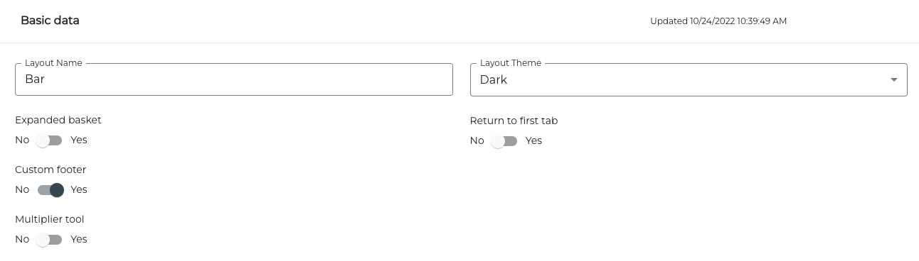
POS Layout Basic Data
Layout Name
Enter the name for the layout in this field. A distinctive name helps you to find the layout easily from the list when modifying the layout or changing the layout.
Layout Theme
You can select the theme for the layout from the drop-down menu. Theme defines the background colour and colour of some default buttons. In the examples below you can see the differences between Bright and Dark themes.
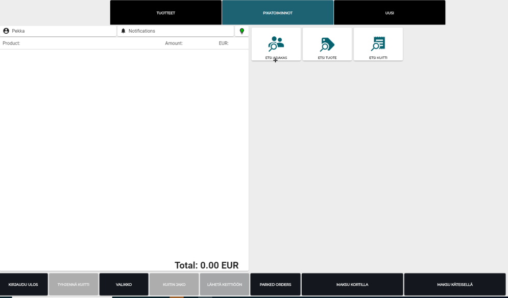
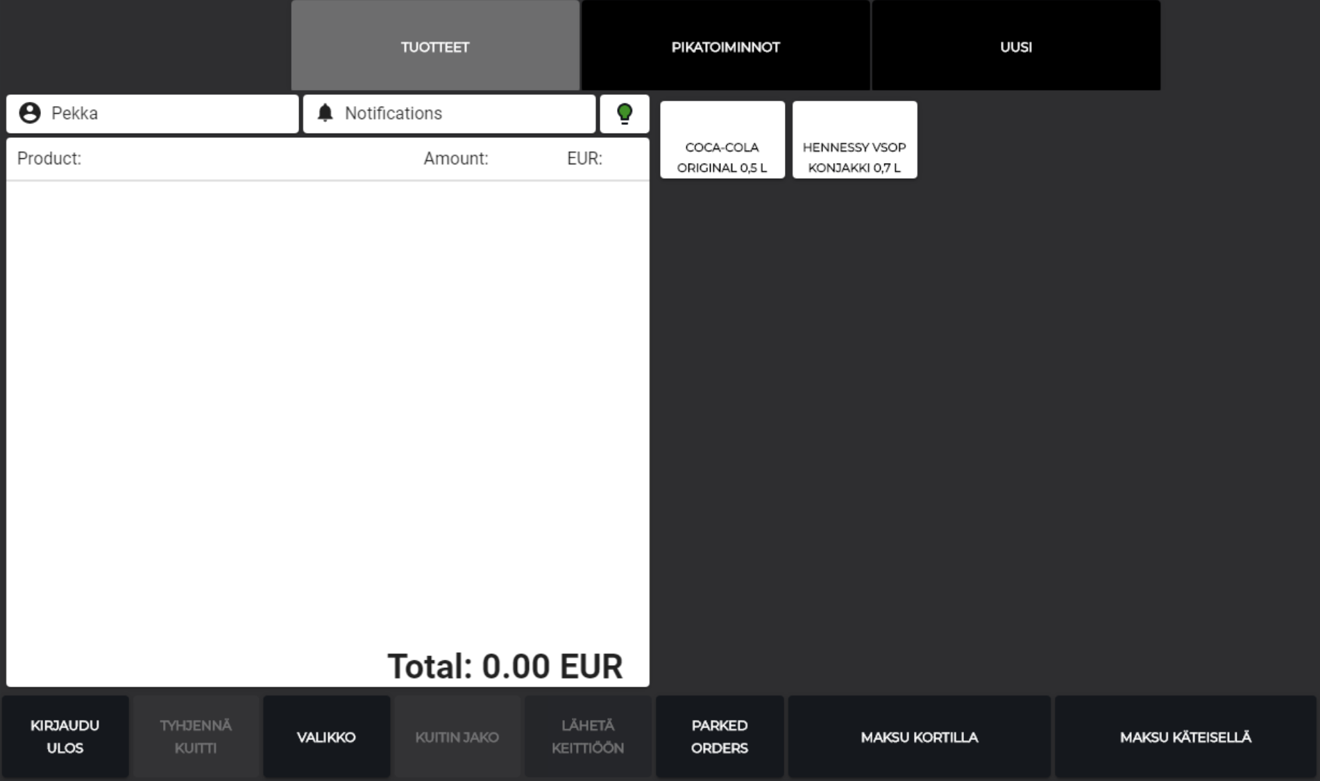
POS layout with Bright theme
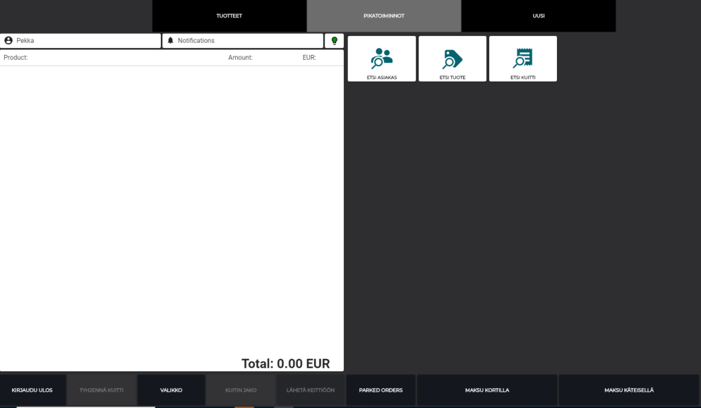
POS layout with Dark theme
Expanded Basket
The Expanded Basket functionality affects the height of the basket - the section where the selected products are listed. If the Expanded Basket switch is ON, basket is the same height as the whole POS view. This is useful when there are only a few tabs; this way the tabs are visible on the other side of the screen. If nesting is not used, the tabs will be located at the top of the screen.
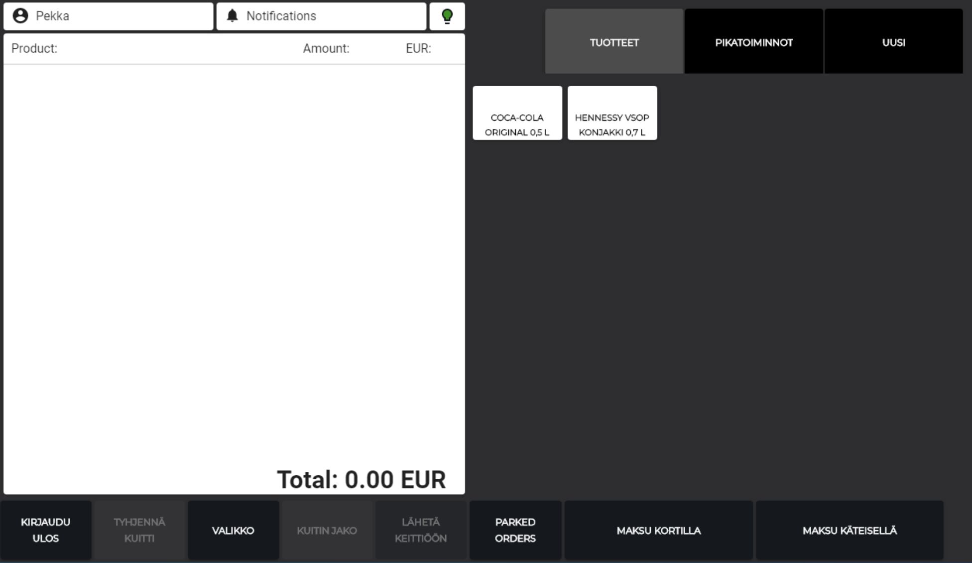
POS layout with Expanded Basket
POS layout when Expanded Basket is not used
Custom Footer
By using the Custom Footer feature you can create a separate row of tiles which is always visible in the bottom of the screen. This way you can easily display the most commonly used functions in the POS at all times.
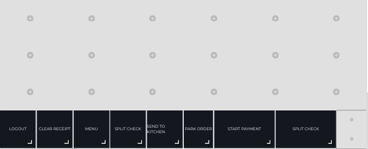
Custom footer in POS Layout Designer
Multiplier Tool
With the Multiplier tool you can define a tool or several tools for multiplying amounts in the POS. When you create a multiplier tool, you can select it when creating new tiles whose Item Type is Action and Action is Multiply.
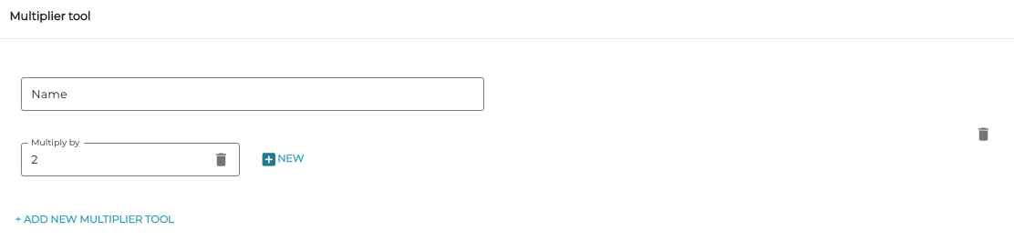
Multiplier tool settings
Return to First Tab
When the Return to first tab switch is set to ON, the first tab in the POS layout will always be displayed after a successful action in the POS.